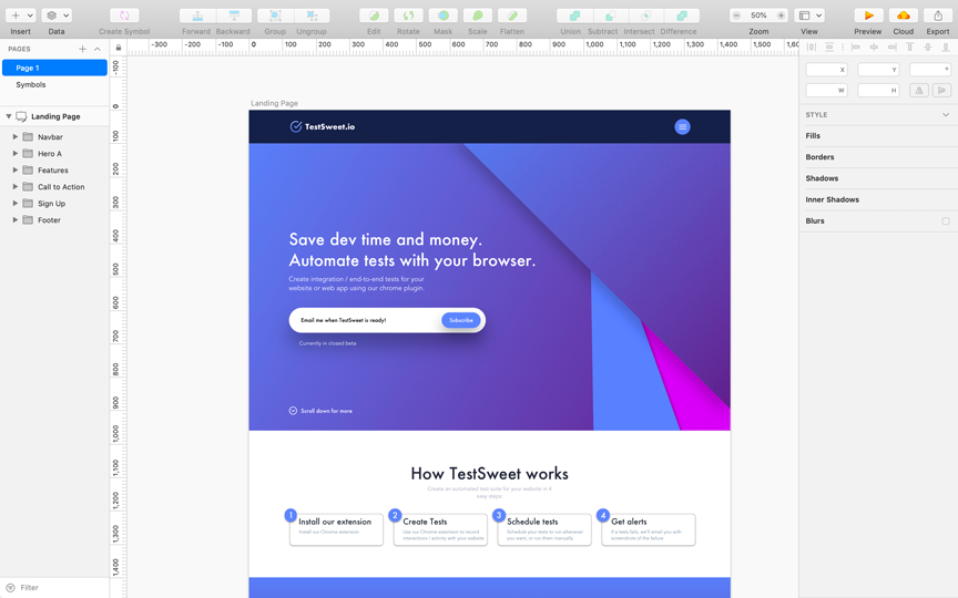
Rapid Prototyping - Design

This article outlines rapid prototyping design techniques. It will cover the following items:
- Sketch - a comprehensive tool for rapid design
- Third party design inspiration - where to look
- Generally accepted landing page principles
- Landing page example
1. Sketch
Sketch is a design toolkit built to help designers create their best work; it is geared heavily towards creating mobile / desktop UIs. If it is new to you, you can think of it like PowerPoint or Keynote, but for designing mobile / desktop application UIs. It is free to try; it costs $99 (one time payment) after the trial period ends.
Sketch is quickly becoming the industry standard for rapidly creating a prototype / landing page design for an idea. To learn more, check out their learning resources on their website, or this Sketch video tutorial on Udemy (it is only ~3 hours long, and it quickly gets you started).
2. Third party design inspiration
As a barely passable designer, I usually base my designs off of the designs created by people more talented than myself. Sketch helps you do this through its extensions and third party UI libraries, both of which are a great place to get started.
Sketch has many extensions that help you create application prototypes quickly. I personally like the extension Envato Elements; I used it to create a prototype for testsweet.io (see 4. Landing page example below). Great UI libraries also exist; check out this great library of free Sketch UI resources.
3. Generally accepted landing page principles
- Contrast is good for CTAs (Calls to Action - i.e. sign up / subscribe to my newsletter)
- Social validation improves conversion rates (i.e. reviews / testimonials)
- Content / copy is the most important thing on your landing page (more important than your visual design). After you've written your copy (i.e. you've written down what problem your product solves and its features), use spacing to group related items together. Use colour and fonts where needed to add contrast to different items
- Some people, like Julian Shapiro, believe you should follow a set landing page format to maximize conversions. While I don't agree, I do think Julian's format is pretty close to an ideal landing page layout for conversions. See his proposed landing page layout here, which is: navbar, hero, social proof, call-to-action (CTA), features and objections, CTA (again), footer (miscellaneous links)
4. Landing page example
Check out the landing page I threw together using the above techniques for my idea (testsweet.io) below!
